
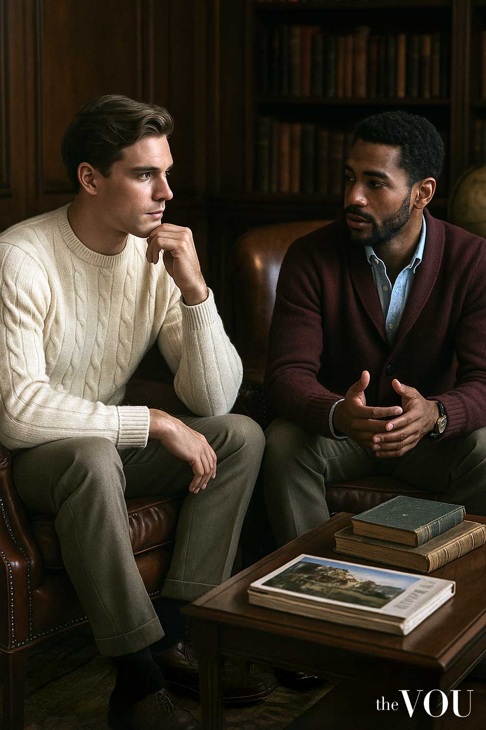
Start here
What’s This About:
The 80/20 colour rule loosely suggests wearing mostly neutral colours with a smaller area of accent colour; the rule is an optional outfit idea rather than an exact measurement or a formula for good style.
This guide shows how to use the rule as a loose guide, such as:
– counting visible colour area rather than garments
– choosing a base you already use
– choosing an accent by placement
– three complete outfits
– adjusting the balance in the mirror
– how 80/20 differs from 60/30/10
and many more!
Use the ratio as a loose aid, and set the ratio aside when a bolder outfit suits the day.
Key Points:
01Judge approximate visible colour area, not garment count; a small vivid tie can attract attention beyond its physical size.
02The rule describes an outfit, not 80 per cent of your wardrobe, clothing budget or purchases.
03An accent need not be bright: a muted burgundy tie against grey or a white pocket square against navy can stand out.
04A bold main colour, such as a green jacket with green trousers, does not follow 80/20 but is not a styling failure, and a seasonal palette does not set a compulsory ratio.
The 80/20 colour rule suggests wearing mostly neutral colours with a smaller area of accent colour.
Think “a quiet base with a coloured detail”, rather than measuring exactly 80 per cent and 20 per cent.
It is an optional outfit idea, not a formula that guarantees good style.
A navy jacket and grey trousers with a coloured knit can follow that idea.
So can an almost entirely neutral outfit with a bright scarf.
The actual balance changes with the cut of the clothes, how you layer them and whether the jacket is open.
What are you counting?
Use approximate visible colour area, not garment count.
A tie is one garment and trousers are one garment, but they do not cover equal areas.
A small, vivid tie can also attract attention beyond its physical size.
The rule does not require 80 per cent of your wardrobe, clothing budget or purchases to be neutral.
Those are different decisions.
Buying four neutral garments and one coloured garment does not establish an 80/20 outfit.
Choose a base that you already use
Black, white, grey, navy, beige and brown can serve as base colours.
Olive may play that role in a wardrobe built around denim and earth tones.
“Neutral” describes their job in the outfit here; it does not mean every neutral garment matches every other one.
Start with the clothes dictated by your day: perhaps grey office trousers and black shoes, or blue jeans and practical boots.
Add the shirt and outer layer you need, then decide where colour would be useful.
A base can contain several colours.
Choose an accent by placement
A shirt, knit or scarf puts colour near your face.
Socks, shoes and a bag place it elsewhere.
Try the same accent as a broad area and a smaller detail if you have the clothes available.
The smaller version may suit the effect you want, but it is not inherently more sophisticated.
An accent need not be bright.
A muted burgundy tie can stand out against grey; a white pocket square can stand out against navy.
Judge its difference from surrounding clothes, not just its name.
Three complete outfits
Business dress: charcoal, white and burgundy
Wear a charcoal suit, white shirt, burgundy tie, charcoal socks and black Oxfords where a business suit is appropriate.
The suit and shirt form the larger neutral areas; the tie provides a smaller coloured one.
Its visible area will usually be much less than a fifth of the whole outfit, so do not label it an exact 20 per cent.
A white pocket square can repeat the shirt if you want one.
There is no need to buy a matching burgundy square, and an extra accessory is not required to reach a ratio.
Smart casual: a coloured knit within darker layers
Try navy chinos, a forest-green crewneck, a navy open jacket, navy socks and dark brown loafers.
The jacket frames the green and reduces its visible area.
Remove the jacket and green becomes a larger share of the outfit.
Both versions can work; the weather and setting determine whether the layer belongs.
If the green feels too prominent, a navy knit with an existing green scarf offers another arrangement in cold weather.
Do not add a scarf solely to make the numbers work.
Casual weekend: a small orange detail
Combine a white T-shirt, charcoal trousers, black trainers and a burnt-orange cap for an informal outing.
The cap supplies a small coloured accent above the neutral clothes.
It is not one fifth of the visible area simply because it is one of several garments and accessories.
Remove it indoors when the setting calls for that.
Adjust the balance in the mirror
- Put on the complete outfit, including shoes and the coat or jacket you expect to wear.
- Notice which colour covers the largest area and which detail attracts attention first.
- If you want less accent colour, reduce the visible area with an appropriate layer, or choose a smaller accessory.
- If the outfit feels too subdued, increase the accent area or compare a clearer shade.
- Check the version without outerwear if you will remove it during the day.
Use the same light for comparisons.
A photograph can help remember an outfit, but exposure and processing can change the apparent colours.
You do not need to calculate pixel areas or agree on a precise percentage.
Can the main colour be bold?
Yes.
A green jacket with green trousers and an ivory shirt may be exactly the outfit you want.
It does not follow a mostly-neutral 80/20 approach, but that is not a styling failure.
Larger areas of colour, two-colour outfits and tonal dressing are alternatives.
A personal seasonal palette can guide the shades you try, especially near the face.
It does not set a compulsory ratio.
Comfort, dress code and practical requirements also matter; a formal invitation is not permission to add a coloured accessory it excludes.
How is this different from 60/30/10?
80/20 loosely separates a neutral base from accents.
60/30/10 suggests a largest, supporting and smallest colour area.
The three-colour rule concerns how many main colours you use.
Pick the aid that solves your particular outfit question; you do not need to satisfy all three.
Related guides on The VOU: pocket squares, Is a Brooks Brothers dress shirt worth it?, How to style a tweed blazer, What is the 70/30 wardrobe rule for men?, What is the 3 colour rule for outfits?, How to achieve dark academia aesthetic men?, How to dress like old money men?, What is the 60 30 10 rule in fashion?, What are the basics of men’s styling?
Mandy Meyer’s focus at The VOU is men’s body-shape styling, garment fit and outfit proportions. Her coverage addresses the practical questions behind a wardrobe choice: how a jacket sits across the shoulders, how trousers fall and how different cuts change the silhouette a wearer wants to create.
Her subject areas include the triangle, inverted triangle, rectangle, oval, trapezoid, hourglass and diamond labels used in body-shape styling. These provide starting references for comparing visible proportions; they do not capture every body or prescribe one correct way to dress. The focus connects those observations with garment shape, construction, length and the relationship between the upper and lower parts of an outfit.
Mandy’s editorial coverage combines visual comparisons with fit checks for comfort and movement. Readers can consider whether a cut gives them the room they need, where clothing pulls or gathers and which changes might support their preferred look. The aim is to make menswear choices more understandable while keeping personal preferences and the wearer’s own styling goals central.